LATEST NEWS


What is the Tactile Paving?
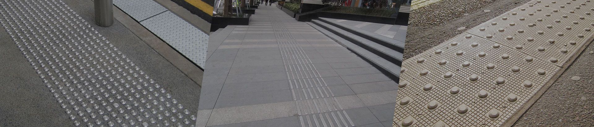
Tactile paving is an outdoor floor that uses raised textures to help guide and inform visually impaired pedestrians about their surroundings. The most common and easily distinguishable shape is the raised round stud, sometimes called the truncated dome. Tactile pavings were first used in Japan in the 1960s to warn blind and visually impaired pedestrians of potential dangers, such as the edges of streets or railway platforms. The texture of the paving can be detected with a walking stick or their feet, so it warns of changes in the surrounding environment in a non-visual way.
Bright and high-contrast colors are also integrated into the tactile system so that pedestrians with low or limited vision can easily detect them. Some forms of tactile pavings warn people when they are in danger; for example, approaching the edge of a railway station platform. The number of tactile patterns that can be distinguished by touch. Most countries use two to six different shapes. Raised studs or truncated domes of tactile paving for blind are usually used where sidewalks intersect the street; however, the arrangement methods of studs including "zigzag" or "parallel lines" have different meanings in different countries.
Closely spaced cross bars, also known as corduroy patterns, usually warn pedestrians when they approach the edge of a train station platform. The size, spacing, and direction of these bars also have their own meanings. These meanings vary from location to location, but they are usually helpful. People with impaired vision will direct themselves to streets or paths with the help. The rhombus is also used in a few countries, especially the United Kingdom. People with limited mobility may face a greater risk of falling on the tactile paving. Using bright colors such as red, yellow, and white on the tactile floor is another way to alert people with low or limited vision about potential hazards or changes in the environment.
In the UK, tactile paving is highly standardized and normalized, and red is only used for controlled intersections. In countries where uncontrolled intersections and tactile systems are not standardized, any color can be used to indicate pedestrian crossing points. Regardless of the color used, the purpose is to create a sharp and easily detectable contrast between the touchable pavement and the surrounding sidewalks and streets. Some places use high-contrast borders around the touchable pavement to achieve the same effect. People with limited mobility who are using canes, walkers and wheelchairs are vulnerable to early textures, especially blisters, which are tall and round; consequently, the wheelchair may slip when traversing. And for people with unstable gait, there was a risk of tripping. The design of the blisters of tactile paving for blind makes it safer by flattening or truncating the top.
As the mobility of persons with disabilities becomes greater and the world becomes more convenient for them, tactile pavement design is continuously improved according to their needs. Some countries are gradually formulating more standardized meanings and regulations for their tactile paving systems so as to reduce confusion and irregularities.
LATEST NEWS
 English
  日本語
日本語  français
  Deutsch
  Español
  italiano
  русский
  português
  العربية
  ไทย
ไทย  Polska
  中文
中文