LATEST NEWS


Why Should the Color of Tactile Paving Be Medium Yellow?
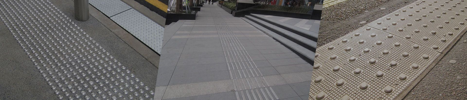
According to the current regulations, the color of tactile paving should be medium yellow. Tactile paving is a road facility designed to help the blind walk. The blind refers to people with visual impairment, mainly divided into two categories, one is blind (ie blind), and the other is amblyopia (less than 60% of normal vision).
People with residual vision and light perception are a huge group. There are also many elderly people suffering from presbyopia, glaucoma and other diseases. They also need to use touch to pave the way to know the way. They account for more than half of the blind people, more than the "completely blind" people, and the color of the tactile paving is of great significance to them. (Light perception: For example, a vision of 0.02 makes it difficult for a visually impaired person to see the face of a person standing face to face, but it is enough for them to distinguish colors, especially huge patches of color. Medically, This situation is called "light perception") in the national laws and regulations for the specification of the color of tactile paving surfaces, which is expressed as "should be medium yellow".
Wuyi Xiongchang Hardware Manufacturing Co., Ltd. has been committed to the design, research and production of tactile paving products for many years, and has in-depth research on the application of color in tactile paving products. People with low vision are more sensitive to the three primary colors of red, yellow and blue. It can be distinguished that in the professional school for the blind, the facilities are also matched with three primary colors. Combined with the fine spray painting process, we have developed multi-color tactile paving products with obvious excellent sense, strong color adhesion, long-lasting non-fading and non-peeling, and meeting the needs of the visually impaired and the visually impaired.
The emotions and associations of the colors of tactile paving products originate from the resonance between designers and actual users, which further strengthens the identification efficiency in practical applications, and the use of different colors reflects the care and warmth of the design.
In the design of Xiongchang's tactile paving, the colors and surface treatments used are closely related to the needs of the visually impaired. Xiongchang's tactile paving products in different colors have quietly penetrated into large shopping malls, subway stations, and It is simple, effective, beautiful and suitable for all areas where the visually impaired travels.
LATEST NEWS
 English
  日本語
日本語  français
  Deutsch
  Español
  italiano
  русский
  português
  العربية
  ไทย
ไทย  Polska
  中文
中文